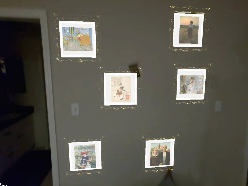
A spatial AR lens built for Snap Spectacles 2024 that transforms real-world walls into an art gallery. Users wearing the glasses can scan their surroundings and pinch to place classic paintings in ornate golden frames—bringing museum-quality art into everyday life.
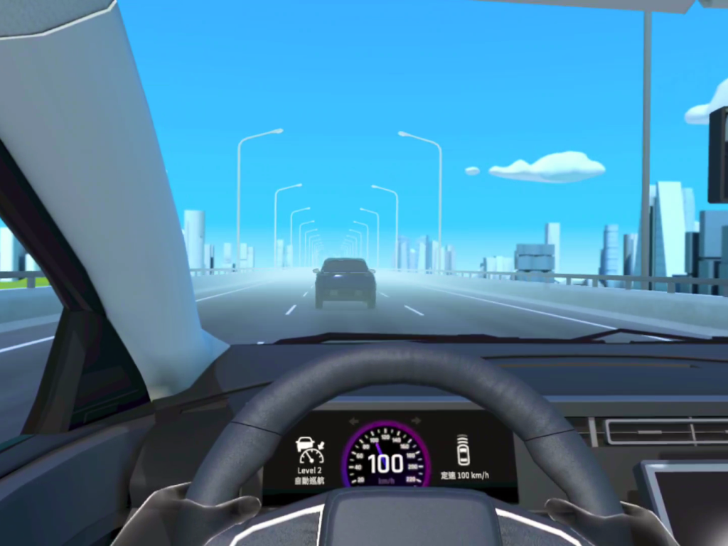
Yulon Motor wanted an immersive centerpiece for its factory tour—a virtual-reality “test-drive” that demonstrates the company’s Level 2 and Level 3 autonomous-driving capabilities. I was engaged as a solo contractor to design and build the experience end-to-end, from rapid concepts to an install-ready Unity application that runs on HTC Vive and Meta Quest headsets.
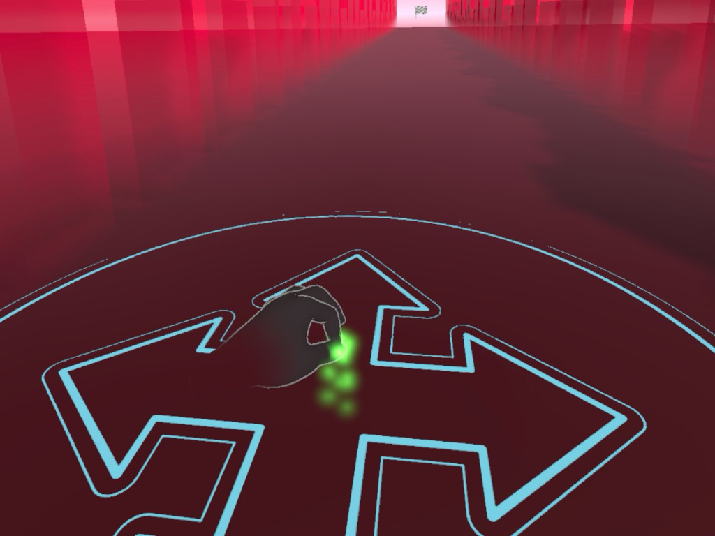
The prototype in this study experiments the hand locomotion by letting users use the pinch gesture to replicate the thumbstick moving behavior. The user testing result shows that users can easily move around with such a gesture without significant motion sickness. However, mapping rotating, jumping, and even flying is still a challenge and it feeds the future exploration.
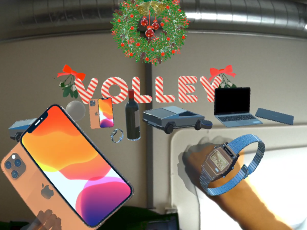
Step into the world of Volleyverse, where voice commands shape reality! Within a mere 24-hour hackathon, we manifested an enchanting “Making-A-Wish” experience exclusively for the Quest headsets. We presend our creation during the holiday season, serving as a conduit for spreading merriment and extending heartfelt Christmas wishes to all volley employees.
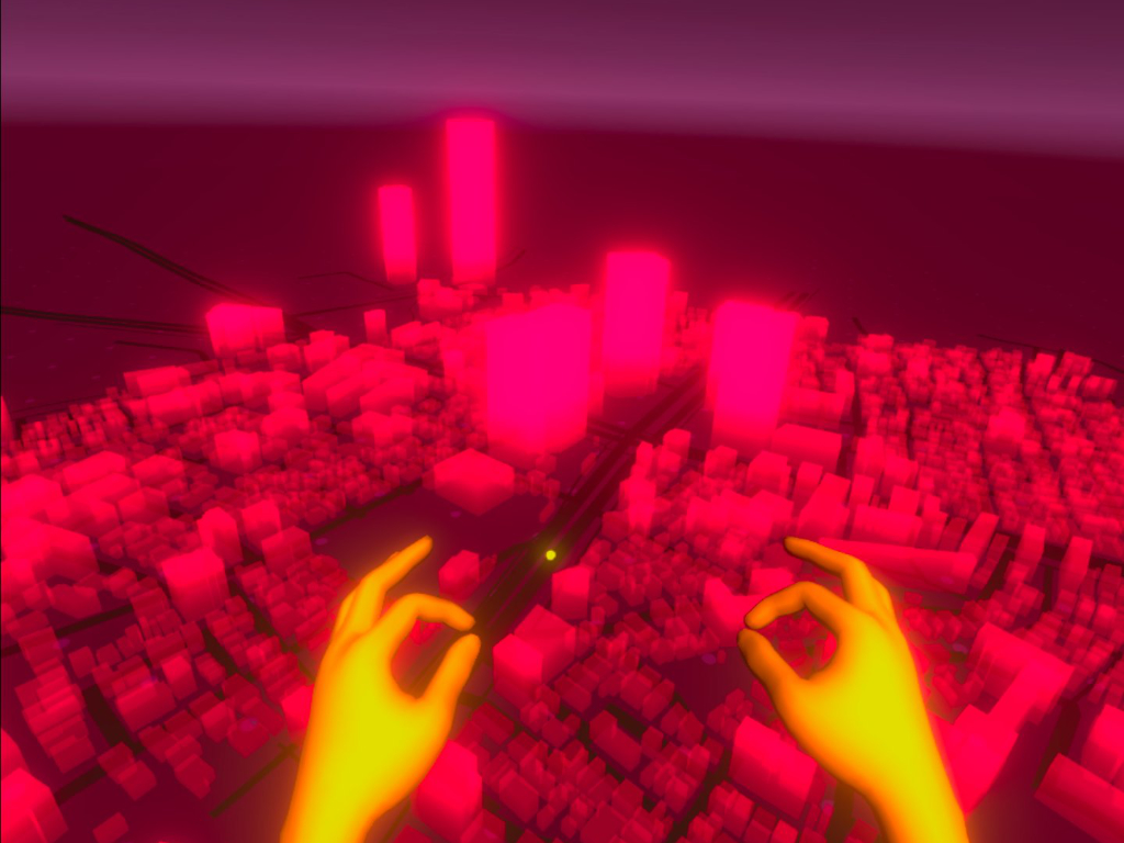
The map interaction experience reminds the VR’s strength in representing real-world scale replica. The instinct interaction with simple hands gestures with miniature metropolis inspires the joy in the RPG and open-world games in VR.
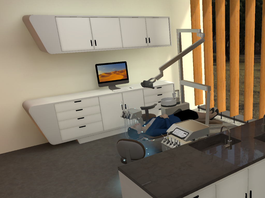
Training in VR is efficient and cost-reserved in general purpose. It also ceases the risk in the medical professions during the training. Diing conducted several high-fidelity prototypes to explore the interaction and use cases for dental students and new pharmacists.
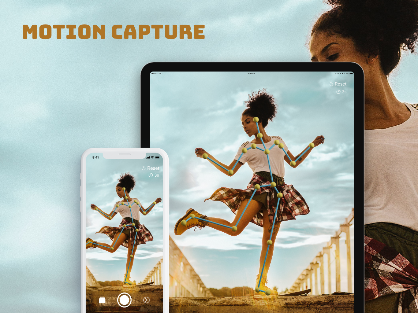
MoCáp turns your iPhone and iPad into your motion capture studio! Rise your iPhone or iPad, point the camera toward a person, and start making your motion capture masterpiece. It saves the motion data into the bvh file. You can then use it in your favorite 3D character creation tool, like Cinema 4D, Maya/MotionBuilder, Blender, Poser, only to name a few.
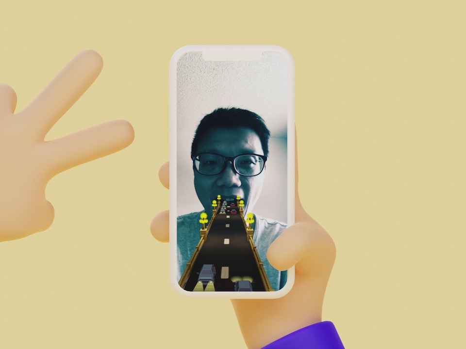
Followed by the weekly bike route along the Arroyo Seco river, the snap lens My LA Impression exposes the imprinted image of LA from my point of view. The well-known Colorado Street Bridge pops up when you put the Snapchat lens toward yourself or a friend and open the mouth. Your mouth is the tunnel for the vehicles on the bridge toward or outward the movie-inspired wonderland, Los Angeles.
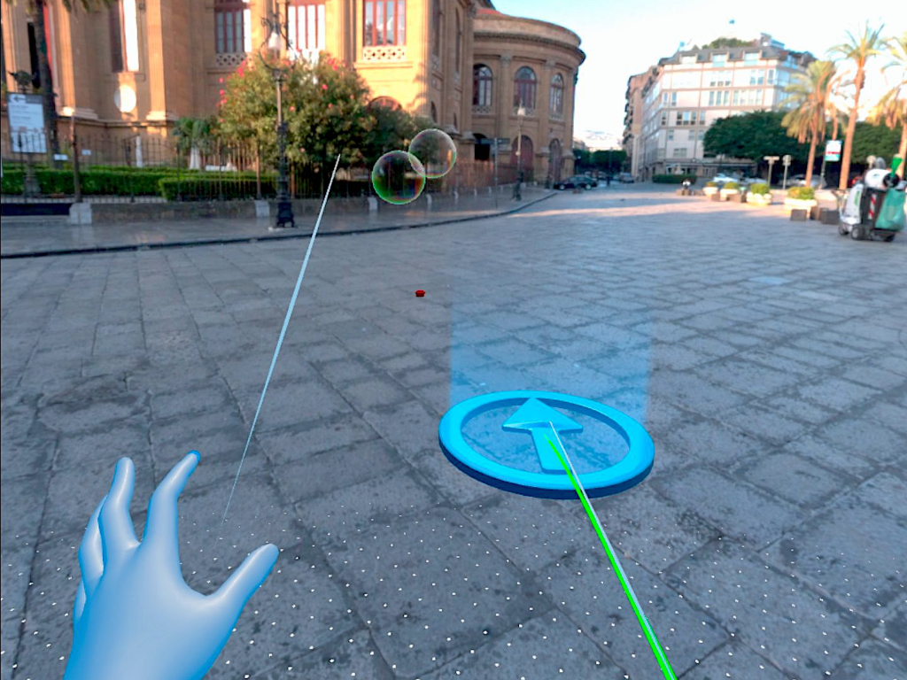
Bubbles is the bubble poking experience in VR with Oculus Quest’s hand tracking technology. It applies metaball and custom visual appearance shader to render the organic shape and reflective surface of bubbles. I also added the sound effect when the bubble brows up to replicate the poking behaviour.
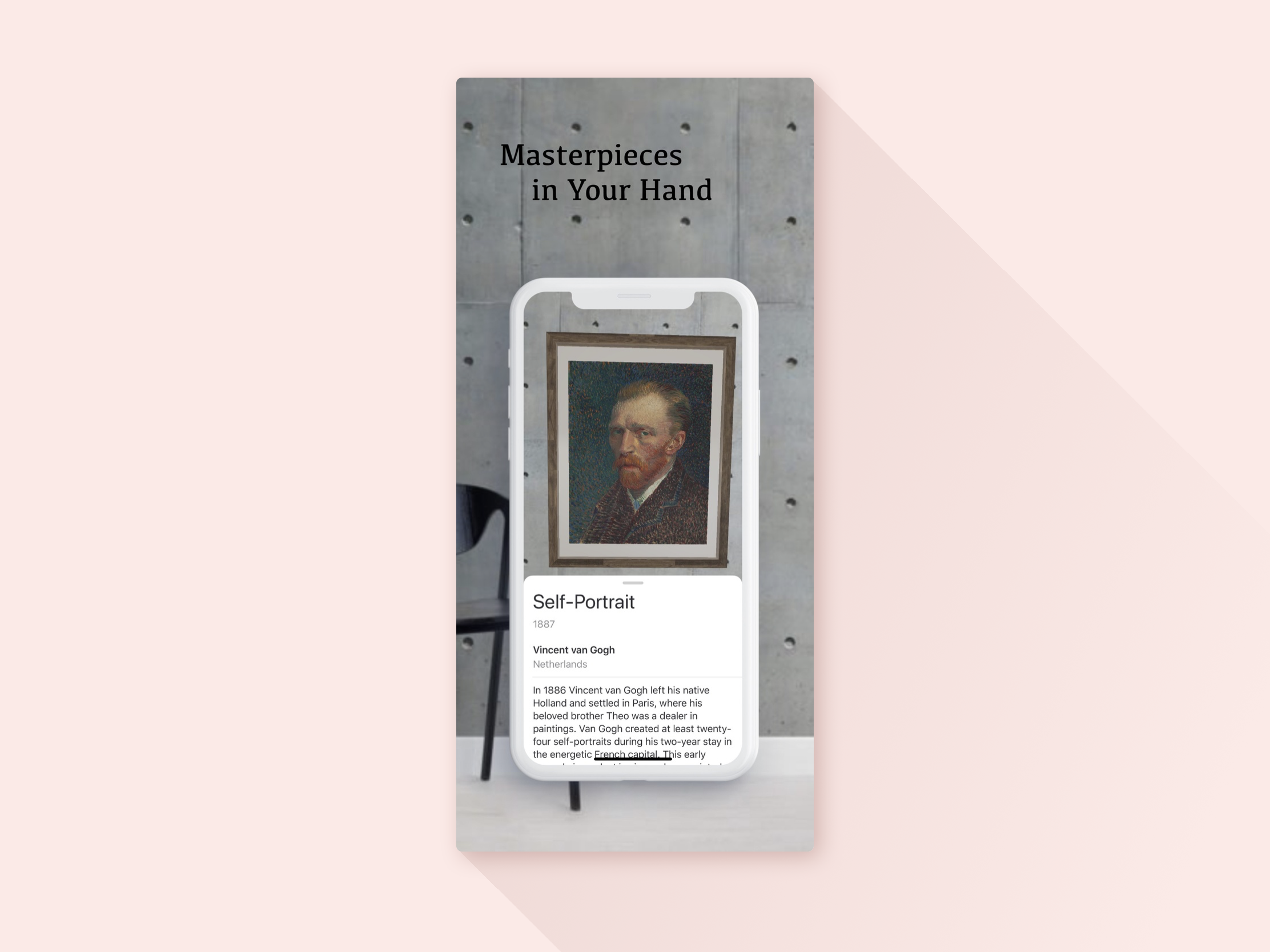
Gallery AR turns the wall, the room, the house or even the city to the gallery with a bunch of famous masterpieces. The app integrates the open art databases from the Chicago Art Institute and places the art masterpieces on your space walls. As easy as holding the phone against the wall and start the art tour right away. Try walking as close as you can and don’t worry about being kicked out by the security guard. Just be careful with the walls ;)
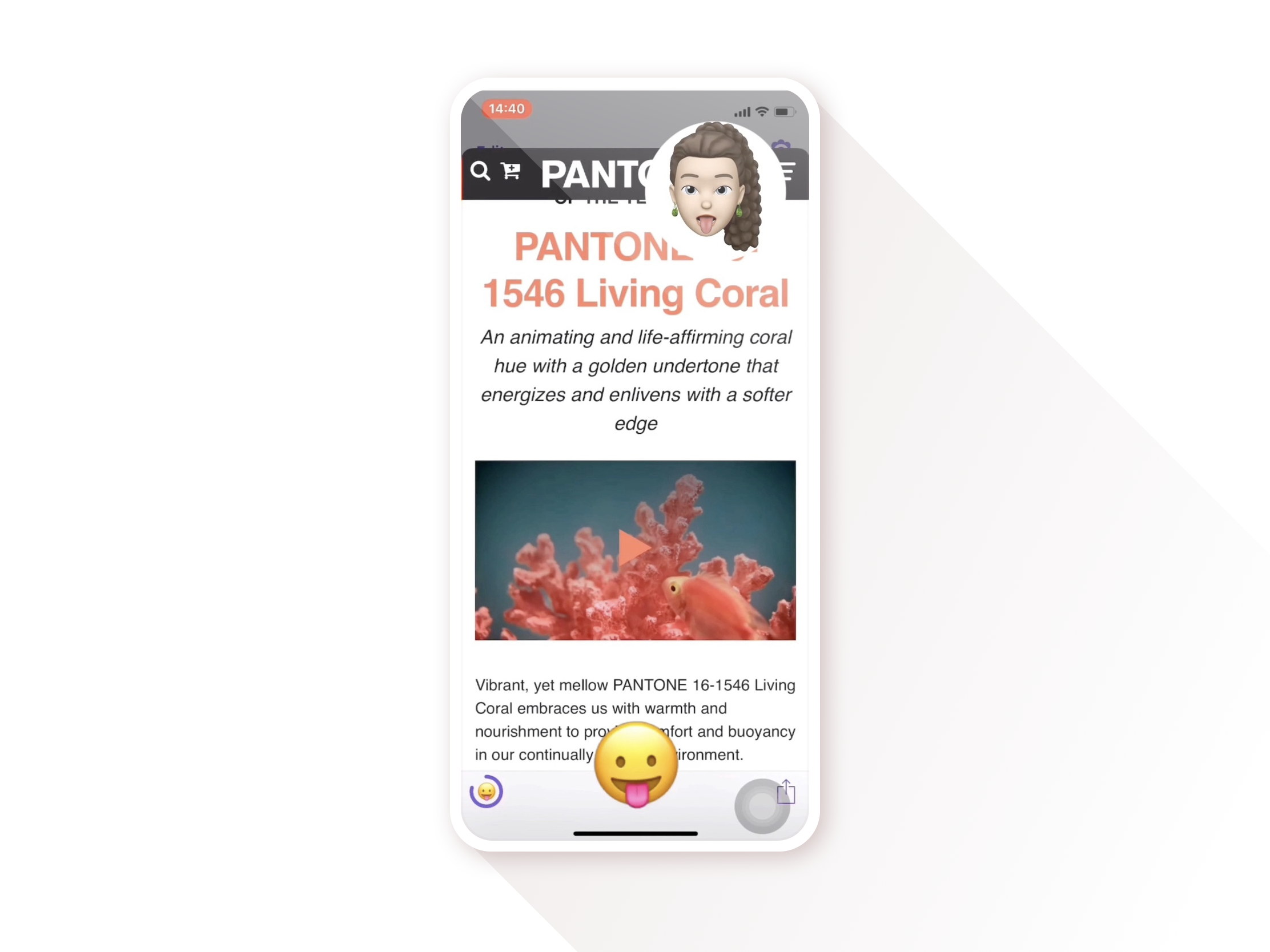
Facroll frees your hands when you browse the webpage. It applies iPhone’s face recognition technology and AI-powered Fasture library and let you browse the webpages with facial expressions. The app is also the working showcase to demonstrate how to integrate these two emerging technologies to a good user experience.
Woca stands for Word Card and makes you learn and remember new English words efficiently through community-crafted pictures in each card. Photos are the best way to learn new words and things. Woca takes it and helps you remember them solidly.
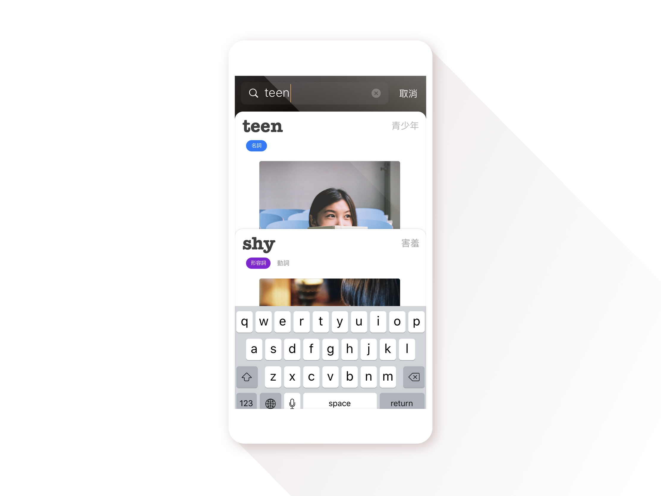
Woca stands for Word Card and makes you learn and remember new English words efficiently through community-crafted pictures in each card. Photos are the best way to learn new words and things. Woca takes it and helps you remember them solidly.
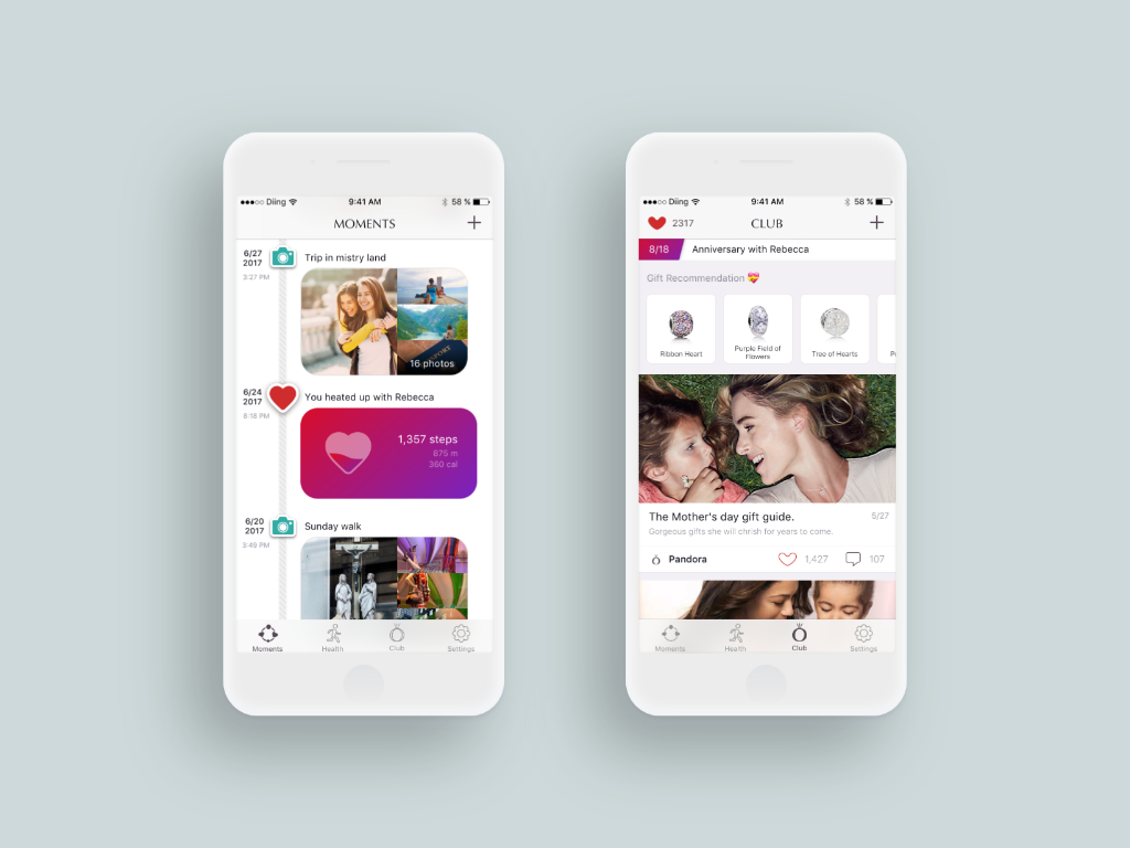
The combination of luxury and technology can boost the human connection. The Jewelry app demonstrates the linkage of the smart bracelet and human beings. You create a moment by sending a love card, launching a heating-up, or sharing pictures, and leave a charm in the beads-linked timeline for your precious memory with the better half.
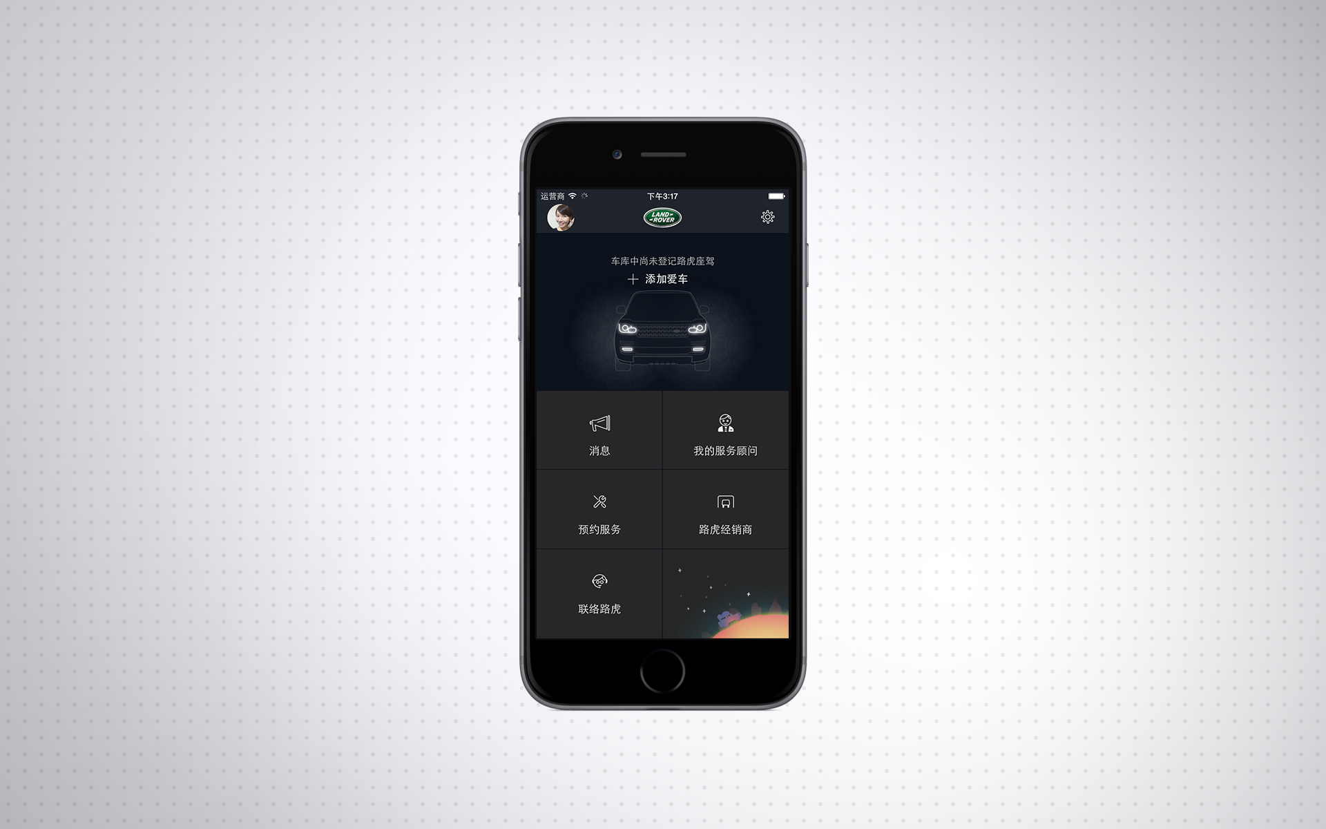
The pair of apps build a direct communication channel between Land Rover car owners and dealers. The chat-based apps provide the bi-directional interaction model between both sides and cease the long-time communication problem. The system also provides a convenient way to broadcast the brand’s message and efficiently manage the booking of services.
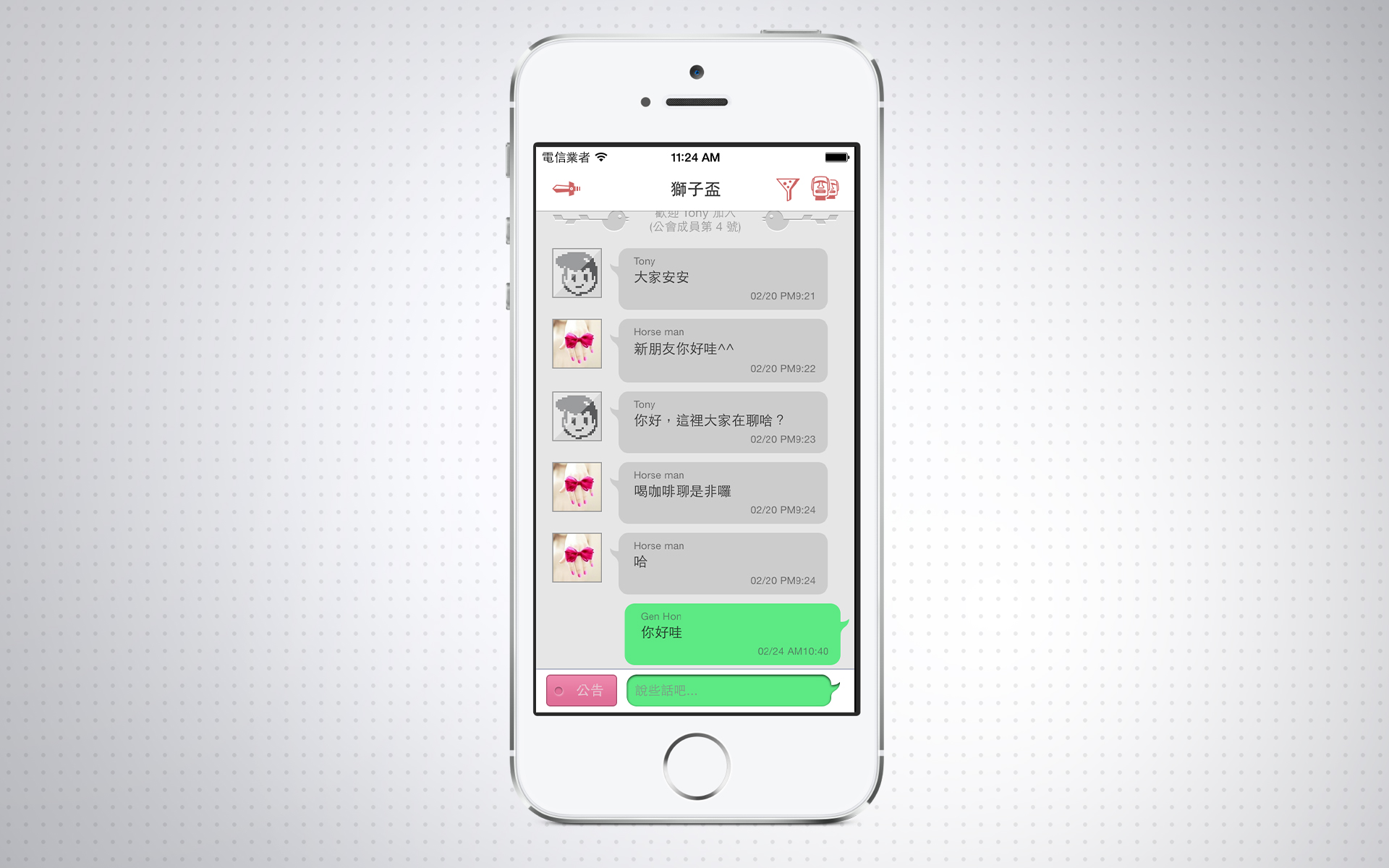
GamerChat is the chat app for online game players. The app gathers the gamers off the game and makes their communication keep going. The hierarchy in the app replicates the online game scheme. It provides features like multi-role set-up for a single user in different chatrooms, Group communication, and fun-factor melody passcode.
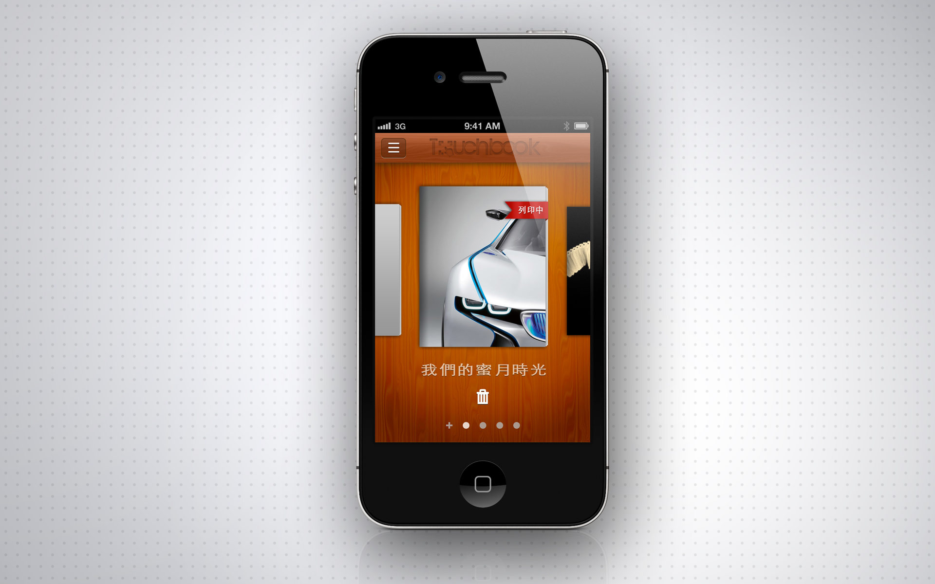
Create your travel memory easily on-the-go! Touchbook works as the tool to make the book easily with finger taps. You can create memory books easily in the app by selecting pictures on the phone and desired template. It also connects to the printing house to flatten the flow to get the book in real life.
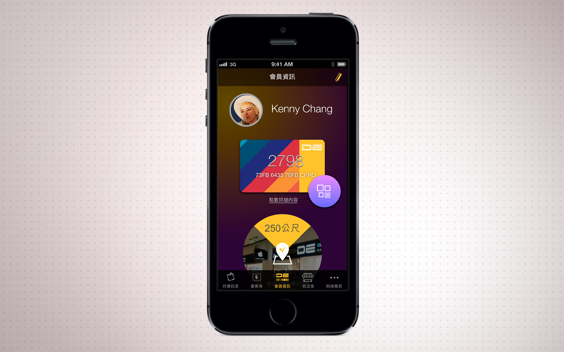
MobiApps is the modulized app platform and the flagship product in the same-name company. The platform produces loyalty apps for retail stores and small business. The template-based design system promises a quick response to new clients, and the modulized architecture ensures the flexibility to the client’s needs. I also applied a variety of prototyping tools to test the design concept and usability agilely.
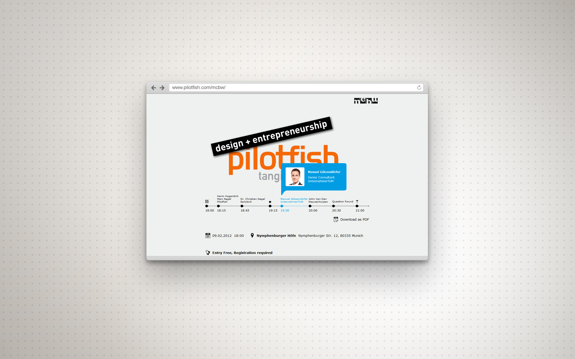
The big innovation event in Munich! Munich Creative Business Week. I designed a webpage to present speech schedule in Pilotfish booth. It’s all about time! The timeline in the website reminds the attendees about the speech schedule.
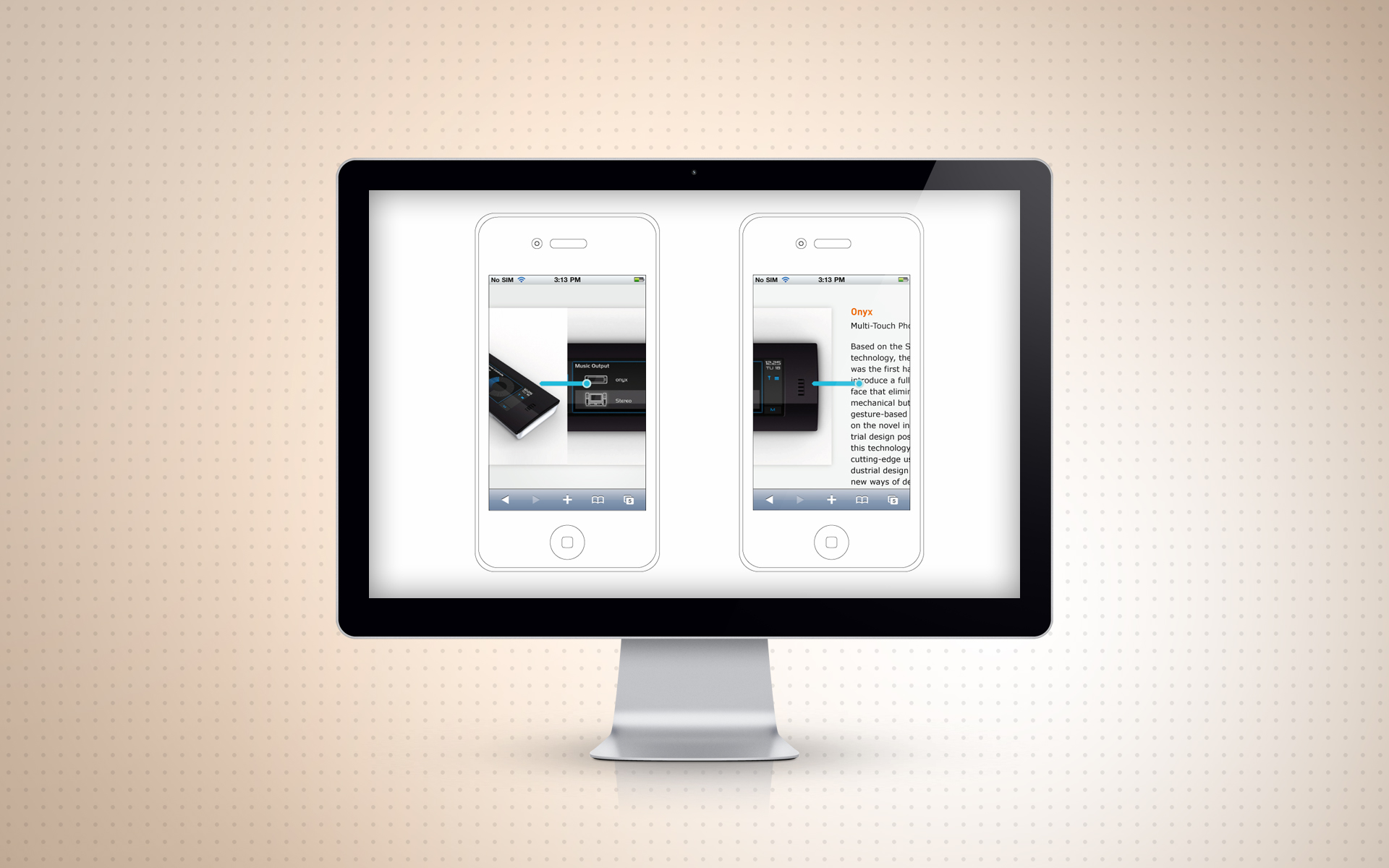
Pilotfish goes to mobile!
Pilotfish was reforming official website to meet fashion web spec, aka. no flash, go mobile. I was in the team to redesign the flow/wireframe of new offical website (include desktop and mobile version). I made bunch of demo units in HTML to present flow, transition and movement to developer outsourcing.
The website was announced in end 2012.
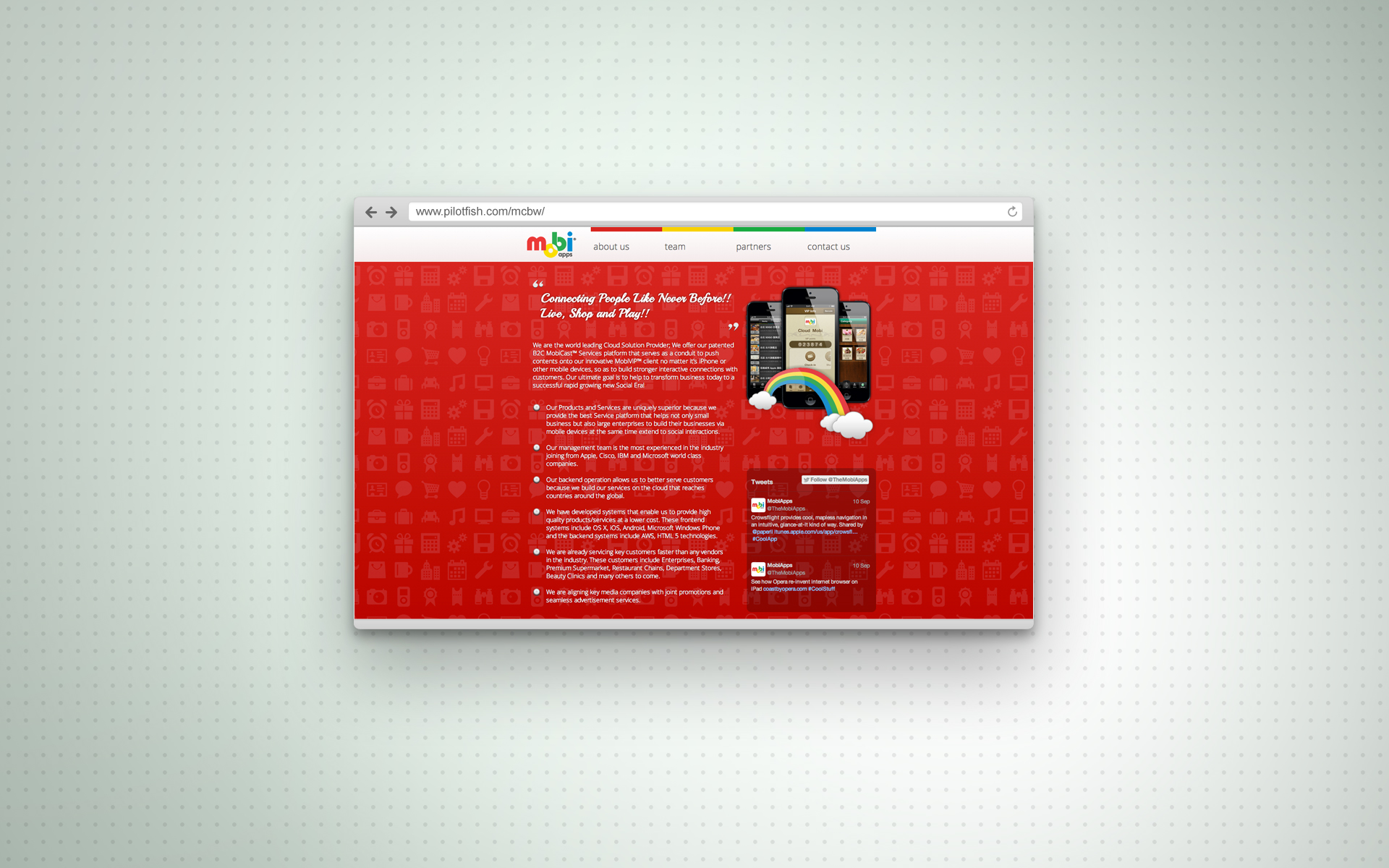
TheMobiApps, the mobile app start-up in Taiwan, was planning to build the company identify prior to media publishing. I designed the whole new website with the 4 key colors in the company logo. The website consisted of the touch keys in present design trend, one-page scroll, simple and html5. It is planned to publish in March, 2013.
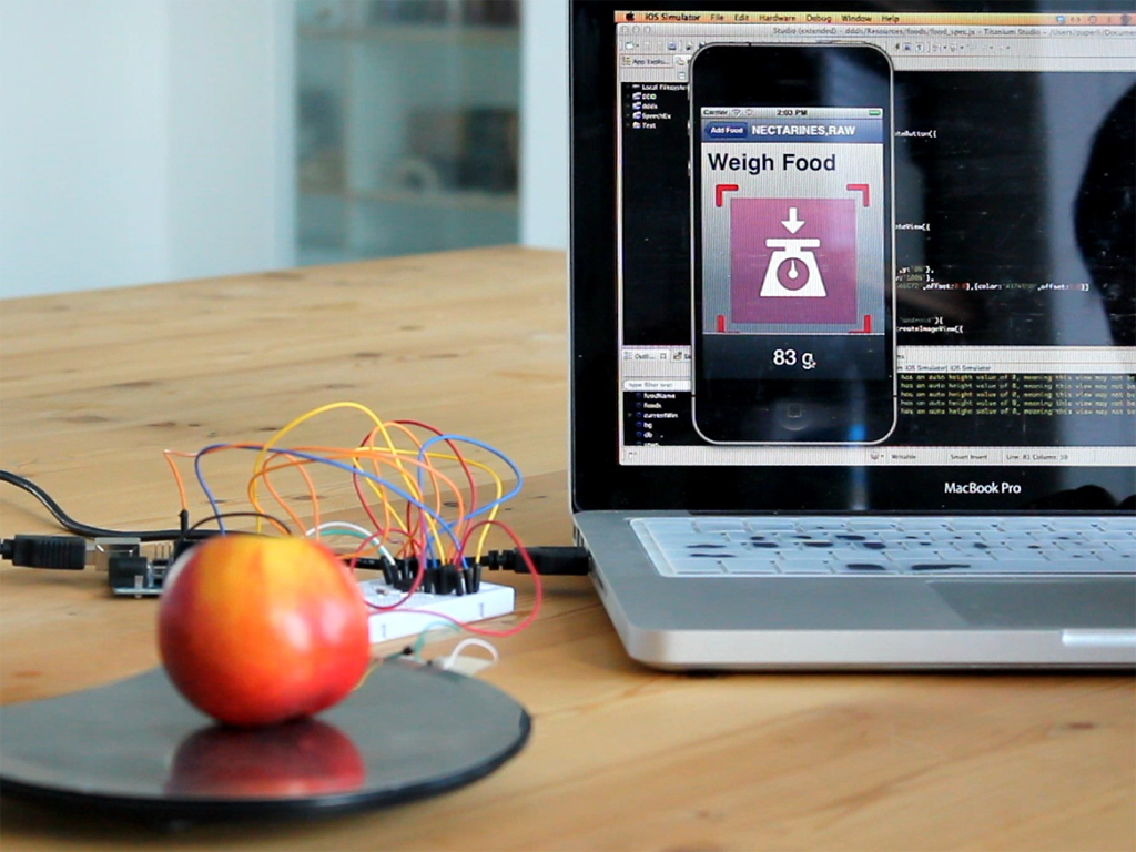
We count for Diabetics!
Diabetics count after dining for blood sugar balance. It may be simple counting for adults, but for kid it’s the problem.
I was joining the team in pilotfish for solving this matter. The project contained two parts: iPhone Case with weight scale and the app to count the sugar contained. I made the wired scale for food weight and passed in cloud. The app count the sugar quantity based on online database and the food weight in cloud. The demo kit proved the concept and gain the success in the in-house design competition.